vendredi 4 novembre 2016

iPhone 6 Plus review

Update: We have revisited the iPhone 6 Plus, which is now packed with iOS 10, and fully updated our review to reflect the new features and lower price.
You'll also find comparisons of Apple's first plus-sized with its latest, the iPhone 7 Plus. As you might expect, a lot has changed - but there's a lot that hasn't, too.
Original review follows below.
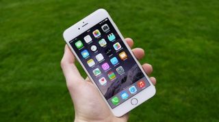
A 5.5-inch iPhone. That might not seem so unusual now, but when it first appeared it was something which would have sent a shudder down the spines of a collective of die-hard Apple fans, as it was a handset some thought we'd never see from the Cupertino-based outfit.
Yet here I am, staring down the barrel of what was once the biggest iPhone in history – the iPhone 6 Plus.
It arrived alongside the iPhone 6 – Apple's 2014 flagship smartphone – which measures 4.7 inches, making it more welcoming to a wider array of palms than the supersized iPhone 6 Plus.
Many of you, especially those of an Android persuasion, may be wondering what all the fuss is about – after all, the Samsung Galaxy Note 2 turned up with a 5.5-inch display years ago.
Take a moment to glance at the history of the iPhone though, and you'll see why the iPhone 6 Plus was such a big deal.
Previously Apple has only dealt in two screen sizes: a 3.5-inch display graced the first five generations of iPhone, and just three have had the pleasure of a larger 4-inch display.
iPhone 6 Plus review
5.5 inches then is a huge leap forward for Apple, moving its iPhone range into the uncharted waters of the phablet market currently dominated by Samsung and other Android manufacturers.
It's less impressive now, with the launch of the iPhone 6S and iPhone 6S Plus(and even more recently, with the iPhone 7 and iPhone 7 Plus) reinforcing Apple's commitment to the larger screen sizes.
Apple is looking to reach a previously untapped audience of smartphone users – those who demand a large screen – with 'productivity' the main buzzword being thrown around. A key market for the iPhone 6 Plus is Asia, where the general consensus seems to be bigger is better when it comes to smartphone screens.
In terms of specs and design, there isn't a huge amount of difference between the iPhone 6 Plus and the iPhone 6, apart from the obvious size.
iPhone 6 Plus review
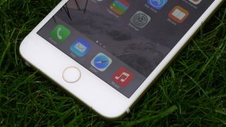
The iPhone 6 Plus does boast a couple of unique features however. It was the first iPhone to pack a full HD display, plus its bigger body means it houses a larger battery than its 4.7-inch brother.
Both sport A8 64-bit processors, 1GB of RAM, M8 motion coprocessors and 8MP rear-facing cameras – although the snapper on the iPhone 6 Plus benefits from OIS (optical image stabilisation), while the iPhone 6 makes do with EIS (electronic image stabilisation). This is a much smaller difference than we see in today's batch of iPhones, with the iPhone 7 Plus sporting a dual-camera setup.
iPhone 6 Plus review

iPhone 6 Plus price

As with all Apple products, the iPhone 6 Plus didn't come cheap at launch, but you can expect to find it much more affordable today.
The iPhone 6 Plus is no longer offered on the Apple Store, pushed out by the iPhone 7. However, the last we saw it, the SIM-free 16GB version was priced alongside the iPhone 6S and iPhone 6S Plus at US$649 (£539, AU$1,079) – and that's just the start.
Apple ditched the 32GB variant for both the iPhone 6 and iPhone 6 Plus long ago, so if you're searching for one, you'll probably have better luck finding the 64GB variant in the wild, which we last saw going for $749 (£619, AU$1229) from Apple.
There was also a 128GB model, but that's been discontinued, so if you need a boatload of storage you'll have to opt for the newer iPhone 6S Plus or iPhone 7 Plus.
iPhone 6 Plus review
Even with some price drops, the Apple iPhone 6 Plus will probably be around the same, if not a little more expensive than rival phablets including the LG G5OnePlus 3Nexus 6P and Samsung Galaxy Note 4.
It's big, it's expensive and it's inevitably played second fiddle to the iPhone 6 – so is the iPhone 6 Plus worth considering? Read on to find out.
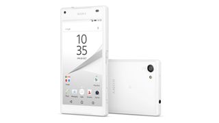
Sony Xperia Z5 Compact review

The Xperia Z5 Compact stands alone: Sony is the only Android manufacturer making a small high-end phone right now. That means that it could be the last stand for compacts. If the Z5 doesn't deliver, it's likely to be the last time we see top specs in a scaled-down form factor, for a while at least.
But it does deliver. Like the Xperia Z3 Compact before it, the Xperia Z5 Compact puts an impressive array of features comfortably into the palm of your hand, and makes you wonder why no other brands are interested in this niche.
Not everyone wants a giant phone, and who could be blamed for wanting to use their whole screen without needing both hands?
Xperia Z5 Compact
The Xperia Z5 Compact sits alongside two other new phones from Sony. There's the Sony Xperia Z5, which offers a 5.2-inch 1,080p screen and 3GB of RAM that you don't get here. Then there's the Xperia Z5 Premium, which will be here in November with a 5.5-inch screen and a 4K resolution screen.
Xperia Z5 Compact
One problem for the Xperia Z5 Compact is its price. High-end specs require a high-end price, even if the reduced frame might lead purchasers to expect a bargain. However, it does come in appreciably cheaper than the Xperia Z5, and a good deal below our original expectations.
The Xperia Z5 Compact costs £429 in the UK (about AU$915) – that's over £100 less than the slightly breathtaking price of £549 that Sony originally put on its site. The new price matches the launch price of the Xperia Z3 Compact last year, and you do get a lot for your money here.
It's a completely different story in the US, where the Z5 Compact unlocked retails for the full price of $500 - ouch! It's not available via popular US carrier subsidies, which will blunt its success, but Amazon does have it on sale for $435.

Design

The Xperia Z5 Compact follows closely the excellent design established by the Xperia Z5. It isn't drastically smaller than the Z5 – the Compact is 127 x 65 x 8.9mm, compared to 146 x 72 x 7.3mm. But it's enough to make a difference.
The Xperia Z5 Compact has lost a lot of the bezel space that felt so redundant on the Z5, and feels a lot more concise than its bigger sibling.
Xperia Z5 Compact
You might have noticed that the Z5 Compact is actually bigger than the Z5 in one dimension: it's a little thicker. That's to fit in all those high-end specs and a bigger battery than the larger phone. I barely noticed the difference in thickness until I put them next to each other, and even then it wasn't all that shocking.
The Sony Xperia Z5 Compact weighs in at 138g, 16g lighter than the Z5. Build wise, it's a similar size and weight to the iPhone 6S.
Xperia Z5 Compact
The back panel is much nicer on this new version of the Compact model. Instead of the clear glass back from previous handsets, it's now a frosted glass that feels good against the palm and looks stylish.
Colour options are white, black, yellow or coral – I was able to use all versions but the white for this review. The black version feels the most stylish, while the yellow and coral are particularly bright. They wouldn't be my choice of phone, but for those who liked the colour-pop aesthetic of the iPhone 5C, they're perfect.
The corners have been rounded off even further on the Xperia Z5 Compact than on the Z3 Compact, making it a much more comfortable fit in the hand.
Xperia Z5 Compact
The anti-break bumpers of the Xperia Z5 aren't included here, so the Compact is more likely to shatter if it falls on one of the four corners. It's unclear why Sony made this decision – they would have been easy to implement, and would make a big difference to the durability of the phone.
At the top of the left hand edge of the phone, there's the indented Xperia logo, which actually looks good this time around. On the bottom of that edge is the only flap on the handset, covering the microSD and nanoSIM slot.
Xperia Z5 Compact
It's easier to open this up than it has been on previous Xperia phones, and as you'll only need to on the rare occasions that you're swapping a SIM or microSD.
In the centre of the bottom edge sits the micro USB port for charging and data transfer. It's a shame that Sony hasn't moved on to USB-C to minimise fumbling when plugging in, but at least the inconvenience of the flap has been removed.
Xperia Z5 Compact
And Sony isn't behind the pack on USB standards, even if it would have been nice for it to get ahead. In a few years, smartphones will have moved on and USB-C will become the norm, but for now most still use micro USB.
The 3.5mm headphone jack sits at the top of the phone on the left hand side, which is the best place for it as it means the phone can sit in your pocket while you use a wired headset
Xperia Z5 Compact
At the bottom of the right hand edge is the camera button, in the perfect position for taking landscape shots. Just above that is the volume rocker, which has been moved since the Xperia Z3 Compact. This relocation is less successful, and some fumbling is required to reach down to it.
Xperia Z5 Compact
It would have been to put the volume rocker just above the power button on the same side, but at least it's not as bad as it is on the Xperia Z5. On the larger phone it's really hard to reach and the handset flips out of the hand easily.
Xperia Z5 Compact
The power button itself sits flush with the design. This is metal with the on/off symbol engraved on it. It looks good, but the exciting part is that this now features the fingerprint scanner – a new addition to the Xperia Z series, except in the hobbled US variant.
On the front of the phone, there are bezels above and below the display to house the front-facing speakers, microphone and front-facing camera. These are thinner on the Xperia Z5 Compact than on the Xperia Z5 and that means a better screen-to-body ratio.

review HTC Desire 816

The Desire 816 is HTC's latest midrange phone. It features a large 5.5-inch HD display, a Qualcomm Snapdragon 400 SoC, a 13-megapixel camera (no Ultrapixel sensor here), and design cues from HTC’s recent high-end products. Out of the box, the HTC Desire 816 runs Android 4.4 with HTC’s custom Sense 6.0 skin.

jeudi 3 novembre 2016

Huawei P9 review

Huawei wants to play with the big boys. The Chinese company wants to be taken seriously as a competitor to Apple and Samsung, but right now it's rooted firmly among the second tier of Android manufacturers, competing with the likes of Sony, LG, HTC and Motorola in western markets.
A reputation for pairing high-end specs with lower prices than some of its competitors, backed up with some solid marketing, has enabled Huawei to start standing out a little from the crowd. And now the company hopes the P9, plugged with an ad campaign starring none other than Superman (Henry Cavill) can take it to the next level.
But Huawei still needs to impress people. No one buys a phone from a manufacturer they barely know without doing a little research first. Huawei knows it, and the P9 has the specs on paper, and a focus on camera technology, that will catch the eye of even the most discerning prospective purchaser.
The promotional campaign and launch event for the Huawei P9 focus mostly on the camera, but the real question on most lips is whether it holds up as a smartphone in 2016.
Huawei P9

Price and release date

  • Cheaper than other flagship alternatives from Apple, Samsung and HTC
  • It costs $530 (£449, AU$799) SIM free
  • Out now - was released back in May 2016
The price is certainly a highlight of the Huawei P9. 
While it's not as cheap as flagships from competitors like OnePlus or Oppo, then handset is still cheaper than the iPhone 7Samsung Galaxy S7HTC 10 or anything from Sony. 
It comes in at $530 (£439, AU$799) SIM-free, which is roughly what a Huawei P8would have cost you when it launched in April 2016.

Design

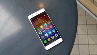
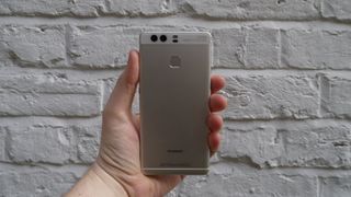
The Huawei P9 has taken the design of the P8 and refined it into a much better-looking device that feels comfortable to hold. It's compact compared to other Huawei devices (like the Mate 8), and that works in its favor.
The P9 is a similar size to the iPhone 6S, but Huawei makes better use of the real estate by packing in a larger screen. The Huawei P9 has dimensions of 145 x 71 x 7mm while the iPhone 6S is 138 x 67 x 7.1mm. So there's just a few millimeters in it, yet Huawei manages to include a 5.2-inch screen while the iPhone 6S only has a 4.7-inch display.
Huawei P9
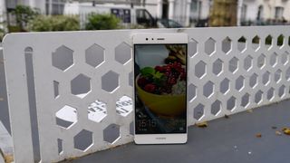
The P9 is a little taller than the iPhone, but that's not a problem. The bezels along the top and bottom of the display are still slim, but allow Huawei to pack a lot of tech inside without compromising the look of the handset.
Huawei P9
Before starting this review I was using a Nexus 6P, which is a larger phone made by Huawei, and the P9 is noticeably smaller. Personally I prefer larger phones, but if you're one for a smaller handset with a large screen this is one of the best-designed phones you'll find today.
Huawei P9
The back of the handset is made with an aluminium unibody and the metal does feel premium, although sometimes I would tap the back of the phone and it echoed a little, which didn't make it feel as high-end as, say, the Nexus 6P.
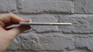
The overall look of the phone is great though, and I particularly like the rounded corners and edges, with the latter making the P9 look even slimmer than its 6.95mm.
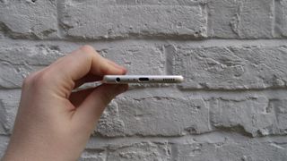
On the right hand edge of the phone is the volume rocker with the power button just below it.
Huawei P9
I found myself rarely using the power button as the fingerprint scanner turns the phone's screen on anyway. The slight grated effect on the button made it easy to identify when in the pocket though. I regularly find myself reaching into my pocket to adjust volume controls and on some phones you can hit the wrong button, but there's no excuse for that here.
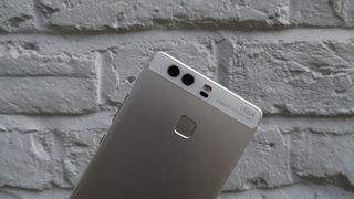
On the back of the phone at the top sits the dual-camera sensor, which I found made some onlookers perk up when they spot it, as right next to it is the Leica logo.
I personally wasn't a fan of this at first, but I've come to terms with it, and it does highlight the fact that Huawei has tapped into Leica's 100 years of photography expertise to develop the camera setup on the P9. Huawei has been pushing this feature at every turn – and with some justification, as we'll see later in this review.
Huawei P9
It's also worth noting that Leica and Huawei have managed to make the back of the camera sit flush with the rest of the phone. Camera bumps have been a trend on a lot of flagship phones in recent years and it's good to see a company fighting against it without sacrificing camera technology.
Color choices for the Huawei P9 are aplenty with three types of gold available as well as silver and grey. Sadly, in the UK you can only buy the silver and grey versions and it isn't quite clear which will be on sale in Australia or the US yet.
There's also a ceramic white version of the phone knocking around somewhere, but no-where seems to be stocking that model yet.
We haven't managed to see it in the flesh either, but Huawei assures us it has a metal body with a ceramic coating on the back to give it a different feel.

Samsung Galaxy TabPro S review


Samsung has played in the tablet space for a long time and even longer in the world of Windows laptops. Now, with the Galaxy TabPro S, the South Korean electronics giant has introduced a Surface Pro 4 rival that also aims to take down the iPad Pro with the full-fat power of Windows 10.
The 12-inch slate is insanely thin and features an extremely vibrant, Super AMOLED display that beats the pants off of almost every Windows device before it. That said, with only an Intel Core m series processor and limited memory, it lags behind some of the best Windows tablets on the market, like the HP Spectre x360.
Samsung Galaxy TabPro S review

Design

There's no overstating how incredibly thin this tablet it is. Measuring just 0.25 inches (0.63cm) thick, the TabPro S is thinner than Surface Pro 4 by a substantial margin, and by a smaller measure, the iPad Pro.
It would be easy to mistake the TabPro S for an Android tablet, as it's almost as thin as the Samsung Galaxy Tab S2. It bares more than a striking resemblance, too, with a similar shape and minimalistic design down to the small camera hump on the back.
Of course, the major difference is the TabPro S is running with a headier CPU and Windows 10 where you might have expected Android to be.
Samsung Galaxy TabPro S review
This Windows tablet also, sadly, is not built with the same magnesium unibody design as the Tab S2. Instead, the TabPro S features a magnesium frame and plastic back. Materials aside, the 12-inch slate feels sturdy and light enough to hold upright for hours on end.
The bezels are a little large by today's standards, especially with those on the side being nearly an inch thick. However, it's forgivable, since these little areas help to actually hold the tablet without triggering the touchscreen.
Samsung Galaxy TabPro S review

Weak bonds

While the TabPro S is an impressively thin and beautifully constructed Windows tablet, the included keyboard base is too flimsy to keep this 12-inch tablet standing.
Like most tablet covers, this folding keyboard folio sticks onto the Samsung's tablet using magnets built into both the case's sides as well as a magnetic anchor above the keyboard.
On one end, a pliable, segmented panel covers the back portion of the tablet and kicks out to extend the base. The bottom of the tablet, meanwhile, clips into a tilting, magnetic strip above the keyboard to hold it either a 115- or 155-degree standing position.
Samsung Galaxy TabPro S review
Tilting the screen between these two angles is annoying, as you need to gingerly separate the tablet from parts of the magnetic case while preventing the whole thing from coming apart. No matter how careful you are, you'll quickly realize the thin back cover isn't strong enough to hold the tablet in place.
The rear cover often slips out of alignment easily, causing the tablet to tumble onto its back, and on more than one occasion I had to catch it before crashing onto the floor. You can also forget about using the keyboard while lying back, as the tablet easily peels forward and falls flat on its face.
Samsung Galaxy TabPro S review
While these magnets are strong enough to support 10-inch Android tablets, with a larger 12-inch device that's not necessarily the case. Specifically with the TabPro S, it's more like cradling a baby who can't keep its head up.
The ultimate downfall of this case is you simply can't just flip the keyboard behind the screen to use it as a Windows tablet. Doing so will cause the device to fall asleep, thanks to a magnet built into the lowest panel segment covering the back of the tablet.
Samsung Galaxy TabPro S review
While you can flick the device back on, the NFC tag built into the left side of the keyboard rubs against the back of the slate. This ends up introducing another problem of triggering a constant stream of connection requests.
It seems like a mistake in design, and it means you'll have to completely detach and toss the keyboard base aside whenever you want to use the TabPro S as a tablet.
Samsung Galaxy TabPro S review

A tablet-class keyboard in a 2-in-1 world

The keyboard itself feels surprisingly spacious both in the size of the individual keys and how they span towards the edges of the device. That said, it's missing a few more media shortcuts than I would like, the keyboard follows a traditional layout, making it easy for anyone to pick up.
Ultimately though, the keyboard feels behind the times, as it lays completely flat on whatever surface you put it on. Many 2-in-1 devices have since adopted attachable keyboards that sit at a slight incline for a more comfortable typing position. It doesn't help that the keyboard looks like the spitting image of the OG Surface Pro Type Cover.
The plastic trackpad is surprisingly decent, offering precise mouse movements and scrolling, though, I wish it were just a tiny bit bigger. You'll also have to be wary of oily prints rubbing onto the keys and permanent imprints of your wrists appearing on the rubber palm rests.